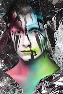
As I mentioned in the last post, I really enjoyed experimenting with this design as each time I have created something different. I was aware in the previous test that although it is important to let my organic, artistic impulses flow freely, I must also be aware of detail and professional application. I feel that I have achieved this in the final design by making extra attention to the brow, lip and cheekbone areas. I am really pleased with the blue brow in particular as it creates a strong balance to the design from soft blending and shading to defined lines and shape.
I also like the focus of the lips as I have created clear definition on one side and a blurred definition on the other that extends into the cheekbone. The merging of facial features is metaphorical in showing how the merging of reality and fantasy within a dream is often linked. By this I mean that the conscious thoughts and aspirations that we have in reality have been both scientifically and psychologically researched to manifest themselves within our subconscious, becoming exaggerated and fantasied.
The clear cellphone roll and emergency blankets were purchased originally as styling props however they also worked very well in creating interesting textures across the face. I particularly like the way it creates another textured layer to the face on top of the existing layers of colour as it gives the concept another dimension.
As the design developed, I layered black shading around the eye sockets, jaw and hair line to give shading and definition which also gave the white upper lashes much more prominence and texture. I decided to use paper for the lower lashes to add a three-dimensional layer to the face which is something that I often try and utilise in my work. I enjoy using texture as a part of 'makeup' as I sometimes find that just using two dimensional makeup product can be restrictive and repetitive.
A pipette applicator was used to drop the ink down onto the face which was a truly fascinating aspect of the design to watch. The organic movement of the ink creeping down the face optimises the concept completely, allowing inner feelings to be exposed as an 'outer self'. The ink moved at its own accord which seemed to bring something alive for me as an artist; I have learnt that I really enjoy not being in total control of a design, allowing something that is inanimate to animate is something very special and unique.
 Water is a running metaphor throughout the book to represent the space of the mind's subconscious. It featured in the first chapter - 'Closing' and will also feature in the last chapter - 'Awakening'. I wanted to experiment with using it in various ways and came up with the idea of making black water balloon necklaces in order to create a climatic explosion. I made 3 necklaces in total, starting very small and becoming progressively larger. However the experiment didn't work too well as the model was not very confident in working with them and it unfortunately didn't look as aesthetically impressive as I had imagined. However I do like the composition in the image below but due to the balloons not showing the explosion of the water, it makes me question how relevant this would be within the concept and progression of the chapter in the book.
This is the last stage of the make-up design whereby the model's face is completely black, leaving the colour of the body and textured layers underneath to show through on the face. The black face is very symbolic in representing the infinity that black presents to the self. It becomes a shadow of each layer, and starts to document the collapse of the dream.


No comments:
Post a Comment