Monday 26 March 2012

Confine, refine, design.

I am now working on the last two chapters of my book titled 'Descent' and 'Awakening'. Both focus on the distortion of the dream through a semi-conscious limbo, and I hope to portray such intricate and conceptual meaning through the visual medium of makeup and photography.

In Interpretation of Dreams, Freud discusses the notion of 'condensation' within the dream-work and how it is irrefutable that dream-formation is based on this process. Condensation has been a highly inspirational metaphor within the design process for 'Descent' as it perfectly encapsulates the movement process of limitless euphoria (symbolised through vapour) to the barrier between unconscious and conscious realities (symbolised through fluid water). There are many meanings and definitions to the word, 'condensation' depending on its context, however some of the most interesting derive from a chemical and psychoanalytical stance.

Chemical: a reaction between two or more organic molecules leading to the formation of a larger molecule and the elimination of a simple molecule such as water or alcohol.
Psychoanalytical: the representation of two or more ideas, memories, feelings, or impulses by one word or image, as in a person's humor, accidental slips, or dreams. 
It is both the symbol of transformation and confinement that fascinates my imagination the most. The idea that something invisible to the human eye, such as vapour, can be transformed into water, a molecule that can be both seen, touched and felt by the entire body is truly fascinating. It creates an almost seamless link  to the study of dreams as our imagination, within an unconscious dream-state, is arguably as free and dynamic as the vapour. However as the mind begins the journey of reaching consciousness, the solidification of water provides an intriguing link to the rationalising of the dream, a common trait for the dreamer. According to Freud in Interpretation of Dreams,
'we distort the dream in our attempt to reproduce it'
which bears a resemblance to the process of chemical condensation. The vapour becomes distorted into a liquid in order to re-enact its previous form, without the disregard of the original state. Similarly, upon reflection of a dream, the dream-thoughts become distorted into a broken-down,  rationalised series of events however to disregard the ambiguity of its original state would create a false significance of the dream.
Reflection such as this is an integral part of not only the conceptual thinking behind this project, but also for the visual creation of it. Similarly to the multi-meaning idea of 'condensation', reflection also shares multiple meanings both physically, scientifically and psychologically.
The most relevant to the project would be the psychophysical aspect, with water being the most important symbol. As mentioned in previous posts, water has been used as a running (no pun intended) metaphor for design throughout the book as it represents the clear space of the unconscious, allowing for perceptive thoughts to flow freely within.


Here are some of my favourite photographs (pre post-production) from the 'Descent' shoot with model, Kasia Bober. Photographed by Lauren Kaigg.


The Real Teal
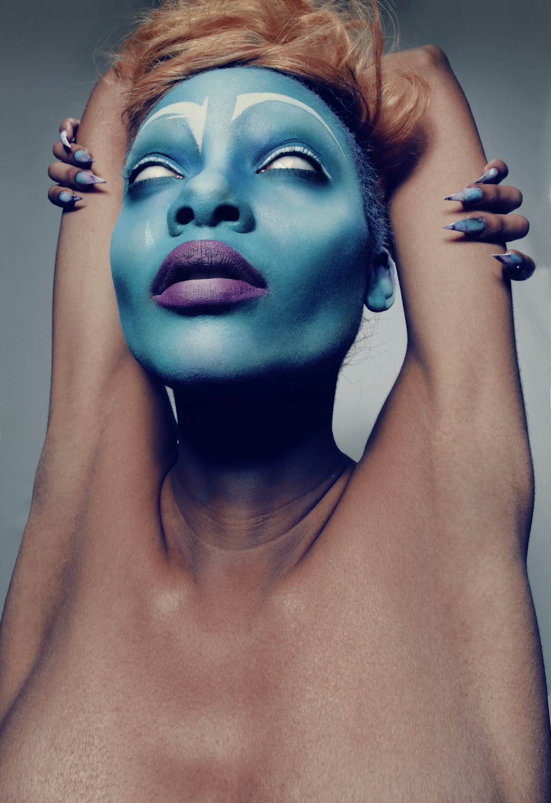
Makeup design for the chapter focuses on the juxtaposition of cool and warm shades on the skin, eyes and lips. Beauty is almost always tonally categorised in this way and I wanted to see the effect it had when combining both together. I think the look is stunning and it captures the disturbed serenity of the dreamer.
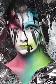
Alex Box
I used a mixture of cream foundations and powder bronzers to create this contoured look on the skin, finding that creams worked slightly better for a more even and quickly blended complexion. I was inspired by Alex Box's design (below) for the skin as she combines a similar idea of using natural colours to create an unnatural, yet beautiful finish and as always, I love her attention to detail and true understanding of facial contours.


Hair design played a very important role in conveying the symbol of the barrier between unconscious and conscious reality. The idea for this actually happened by accident, which is the way that I find most of my ideas happen! Whilst I was making the brow mask (pictured below) I fitted it to my face in order to test for size. My hair happened to be on my forehead when sliding the mask down, causing it to be caught under the mask. I really liked the way the mask trapped the hair as it reflects on the way a dream often represent trapped, or fantasised desire.
Dream Esteem

The contrasting textures of hair and metal is another interesting element to the design as both are contributing to the symbol of confinement but in both a natural and unnatural way. The chains act as a continuation of the hair which is intriguing as it seems to suggest that the chains are coming from within the self, making a subtle statement about unconscious self esteem.

Art directing each shoot is something that I have really enjoyed doing throughout the whole process. The project is very personal to me and my journey throughout this course therefore I feel that my direction is very important. We used a black hive-like board for some of the shots which I really enjoyed as it was a very experimental photography technique. Lauren could only see light and dark through the grill so getting the perfect shot was a bit like playing the lottery! This is my favourite shot as I think Lauren has captured the perfect amount of light, shadow and texture. Kasia's gaze is very alluring, with her right eye being perfectly aligned to the viewer's eye.
I have really enjoyed working with textures within an image as appose to adding filters in post production as I feel that it reflects my style and motto as a makeup artist. I never rely on PhotoShop to correct my mistakes and I feel that by using primary texture as appose to secondary (post) it allows me to connect with the image much more, and will hopefully act in the same way to the viewers of the book.


I decided to adjust the teal lip as the shoot progressed as I thought it would be striking to use the teal to smudge on the outer corners of the lip with a natural prominence of brown for the remaining area. I feel that this gives more of a raw quality to the concept as appose to being predominantly fashion based, however both are equally as important in exploring the concept of my book.

Movement shots


As the shoot progressed, Kasia, Lauren and I become more experimental with direction and posing and this is definitely where my vision for the shoot was made much more vivid. I really loved the way the hair remained static yet the metal chains were free to dance and jump around the face as it gives a dynamic and almost surreal quality to the images.

The movement of the chains is a symbolic representation of the erratic movement of the mind when descending into a conscious state. Kasia's engagement with the camera gives the concept a fascinating depth and etherial quality which is just how I envisaged it to be. Edits coming soon.


Model: Kasia Bober
Photographer: Lauren Kaigg
MUA, Hair and Stylist: Lara Himpelmann


Lucid


Pre-edit
Here are some more of my favourite images from the third Climax shot. Similarly to the first Climax design, the idea behind the art nude concept was to use product in a sporadic and organic way to mirror the way the mind is able to function in such a way. I used poster paint mixed with water and, using my own hands, I massaged the paint into Chloe's hands and lower arms. I always seem to find that the more I can connect with the model I am working with, the more my concepts flow freely, and the more experimental my makeup application can feel. Chloe and I were completely at ease with each other which made the whole shoot really enjoyable.

I love the curvature of these shots as it reflective the lucidity of the dream state. I have included both pre and post production shots which bring much more vibrancy and light to the face and scarf. I wanted to create the idea of the mind starting to confine itself within the climatic stage to gradually integrate the theory behind the following chapter, 'Descent'. This image represents a sense of disturbed tranquility which I really like, as it is such contrasts that define what my concept is truly presenting. 


The Centrefold (Climax series)

Sometimes I do surprise myself with my ability to make things. I have been searching for so many weeks to find a few fantastic stylists to work on the project with me, and have had all round positive responses, however the general thesis was that they were all too busy running around for London Fashion Week and were reluctant to help and not give their 100% - not the best timing! However these things are set to try us, as they say, and from it I have learnt that I am quite good at making things myself, which has given the project an even more personal touch.

Alexander McQueen - 2012
The last 'Climax' shoot was a few days ago which went really well. I took a lot of inspiration from Lan Nyugen's and Alexander McQueen's designs for this shoot in terms of dress design, makeup and composition. I managed to book a fantastic published model - Chloe Jasmine Whichello - who was a real joy to work with. Her positive energy really came across in the images and were perfect for the mood of the centrefold in the book. I spent around 6 hours yesterday with my tutor/professional retoucher Chris Overend working on the Climax centre series and found it very challenging, however with his expertise, I have learnt many new techniques and skills in PhotoShop that I never thought I would be capable of achieving. The real satisfaction when finishing the series is a great feeling, and I am very excited to see it printed in the book. I am hoping to create a pull-out section in the centrefold which will comprise of four A4 pages instead of two, giving maximum impact to the image.

We created 2 edits

Edit 1 - This edit has two extra figures seen on each end of the image. I wanted the image to look chaotic and full of dynamic energy which is why I chose to include more figures. Choosing each pose was very carefully considered as it is important to show a sense of flow and to tell a story through movement and expression. I had to flip some of the images in order for the flow to I particularly love the third figure from the left as she is not instantly recognisable, prompting the eye to look closely at the series.


 Edit 2 - This is a much preferred edit as I have removed the two figures at each end to allow for more space each side. I feel that this gives the image more of a refined finish as the hands on each end seem to create an invisible border.


Friday 9 March 2012

"If I lose half my sight, will my vision be halved?"

The second Climax shoot was very much inspired by the 1993 film 'Blue' directed by Derek Jarman. Against a plain, unchanging blue screen, the film follows a densely interwoven soundtrack of voices, sound effects and music which poignantly conveyed a portrait of Jarman's experiences with AIDS, both literally and allegorically, together with an exploration of the meanings and personifications associated with the colour blue. Here is a short clip from the beginning of the film:
The make-up design for this element of the Climax is designed to exude a sense of movement with colour, aiming to make a statement about the way colour can work as a language. Jarman fixates and almost meditates on the colour blue to reflect the loss of his sight and asks a poignant question

"If I lose half my sight, will my vision be halved?"


This is a fascinating idea and interrogatively questions whether physical sight can equalise a true vision as it could be said that true sight can only be envisioned through imagination. Ultimately, in order to express original and innovative designs within makeup, ideas must only be seen with the imagination as appose to the eyes as this allows for organic expression and unseen creations. 
I decided to use a darker skinned model for this design as the contrast of warm and cool tones of the blue, brown and orange hair worked very effectively. I used an airbrushing technique again for the make-up, as well as preparing the nails and airbrushing a marble effect onto them which looked great. I have really learnt so much from using the airbrush and now understand how versatile it can really be. Here are some of my favourite shots.


Italian futurist artist and sculptor Renato Bertelli was an inspiration for the reference development and composition of the photographs. When I was visiting the Guggenheim last year in New York, I was fascinated by one of Bertelli's most noted works "Head of Mussolini (Continuous Profile)" created in 1933. The profile of the face seems to be moving very fast yet it is completely stationary, which reflects on Jarman's idea that our vision isn't necessarily halved if sight becomes lost or even out of focus.
Renato Bertelli -  "Head of Mussolini (Continuous Profile)" 1933


 The colour blue is an aural spectacle in the film, and likewise aims to speak in a similar way through my design. Here are some of the movement images before full editing. Lauren experimented with slow shutter speeds which perfectly capture the essence of my concept. I love the way the features have blurred into each other and have been organically repeated like a niggling thought in the mind.  This process has been further inspired by artist and sculptor Renato B.


Kayleigh Hand - Illustrator


Zoren Gold and Minori
I worked with friend and animation illustrator, Kayleigh Hand to produce a series of graphic drawings that create my concept of 'outer styling'. As I could not find a professional stylist to help with the project, I started to think of ways in which I could use this setback as an advantage, and used ideas such as body painting, making certain pieces of clothing myself, and now the 'outer styling' idea which comprised of a digital impression of shapes and textures of clothing using PhotoShop. I was inspired by the wonderfully creative Tokyo-based dup Zoren Gold and Minori, with their contemporary approach to surreal photography, illustration, collage and graphic design. I purchased their book titled 'Object That Dreams' which features a wonderful array of fashion blended with illustration, textures and post production effects and found it very inspiring. 


Although the artwork that Kayleigh produced is stunning, when I compiled it together with the series and storyline of my other images, I felt that it hindered the sense of flow and natural progression. I think this may be due to the lines having a fairly science-fiction mood to them, something that my other images do not present. However it was a great experience to collaborate with such a talented graphic illustrator as it taught me how to direct my vision as an art director.

Let go of order

Tuesday was the first day of shooting for the Climax chapter. It was an eventful day to say the least! The model that I have had booked for 5 weeks unfortunately had to cancel leaving me very little time to find a suitable replacement. As I am always very organised and like to design looks to suit individual faces, model cancellations can be very stressful. Luckily, the look I have designed relies on the eyes as a main focus, with the face acting as a blank canvas for the design so the model's skin tone and texture was not as much of an important factor to consider.

As I mentioned in the last post, I really enjoyed experimenting with this design as each time I have created something different. I was aware in the previous test that although it is important to let my organic, artistic impulses flow freely, I must also be aware of detail and professional application. I feel that I have achieved this in the final design by making extra attention to the brow, lip and cheekbone areas. I am really pleased with the blue brow in particular as it creates a strong balance to the design from soft blending and shading to defined lines and shape.


I also like the focus of the lips as I have created clear definition on one side and a blurred definition on the other that extends into the cheekbone. The merging of facial features is metaphorical in showing how the merging of reality and fantasy within a dream is often linked. By this I mean that the conscious thoughts and aspirations that we have in reality have been both scientifically and psychologically researched to manifest themselves within our subconscious, becoming exaggerated and fantasied.

The clear cellphone roll and emergency blankets were purchased originally as styling props however they also worked very well in creating interesting textures across the face. I particularly like the way it creates another textured layer to the face on top of the existing layers of colour as it gives the concept another dimension.
As the design developed, I layered black shading around the eye sockets, jaw and hair line to give shading and definition which also gave the white upper lashes much more prominence and texture. I decided to use paper for the lower lashes to add a three-dimensional  layer to the face which is something that I often try and utilise in my work. I enjoy using texture as a part of 'makeup' as I sometimes find that just using two dimensional makeup product can be restrictive and repetitive.

A pipette applicator was used to drop the ink down onto the face which was a truly fascinating aspect of the design to watch. The organic movement of the ink creeping down the face optimises the concept completely, allowing inner feelings to be exposed as an 'outer self'. The ink moved at its own accord which seemed to bring something alive for me as an artist; I have learnt that I really enjoy not being in total control of a design, allowing something that is inanimate to animate is something very special and unique.


Water is a running metaphor throughout the book to represent the space of the mind's subconscious. It featured in the first chapter - 'Closing' and will also feature in the last chapter - 'Awakening'. I wanted to experiment with using it in various ways and came up with the idea of making black water balloon necklaces in order to create a climatic explosion. I made 3 necklaces in total, starting very small and becoming progressively larger. However the experiment didn't work too well as the model was not very confident in working with them and it unfortunately didn't look as aesthetically impressive as I had imagined. However I do like the composition in the image below but due to the balloons not showing the explosion of the water, it makes me question how relevant this would be within the concept and progression of the chapter in the book.

This is the last stage of the make-up design whereby the model's face is completely black, leaving the colour of the body and textured layers underneath to show through on the face. The black face is very symbolic in representing the infinity that black presents to the self. It becomes a shadow of each layer, and starts to document the collapse of the dream.

Thursday 8 March 2012

Nothing is more powerful than an idea

I recently ran a half marathon for charity which has been keeping me very disciplined, working to a structured training regime and I guess a matching frame of mind. As I am in the process of designing for the Climax chapter which is the most creatively demanding, I feel that having such a disciplined frame of mind may have hindered my ability to release the full potential of my creativity so far. After the last test, I have come the conclusion that my subconscious creativity has become restricted which could be a combination of training for the half marathon and from using airbrushing techniques as appose to brushes. However I am always looking to forward my approach to design and feel that my awareness of 'holding back' is important in order to change and really allow my creativity to flourish.

I have been inspired by the progressional nature of colour from the beginning of the concept for the book, and have been looking at ways in which colour and texture is used in art, film and photography to express a sense of personification and 'trippy' reality for the Climax chapter. I like the idea of beginning with a blank canvas as this reflects the way in which the subconscious is penetrating the mind without realisation and allows for me to experiment with the idea of progression which is the main focus for the whole concept of the book.


I tested this today in the studio and it was the first time where I have truely immersed myself into a design without thinking too critically about what I was doing. I feel that there are both positive and negative aspects to this mode of working as colour compositions and textures tended to work really well however I feel that precise application was affected. I feel that by feeling totally free, my eye was drawn to the image as a whole, as appose to focusing on minute details in order to make the design appear as professional as possible. I am going to make sure that I focus my eye on certain details for the final design to ensure that the look has been carefully considered.

The thing I most enjoy about this design is the element of climatic suspense as I feel that this reflects in the personality of a dream, and how it progresses like a movement, both visually, audibly and emotionally. The design reflects the build up of emotion through colour and texture, with the layers of colour metaphorically showing the layers of both conscious and subconscious thought. The black paint seeping onto the face creates an element of uncertainty within the mind until the face reaches a 'black-doubt' fantasy. I really like this play on words as I feel that it succintly sums up the progression of the book. It links to the theory raised in my short film which also shares the same title. Here is another quick link:

Filmed and directed by Lara Himpelmann

Pseudo-Reality


This short film directed by Andrew Huang provides a great link to the notion of letting the self fall into a state of disturbed order, into an ironic world where the outer controls the inner and where falsities seep into the realms of reality.  The progressive movement and beautifully destructive nature of the film correlates to the nature of my own designing for the Climax chapter which I find very inspiring.